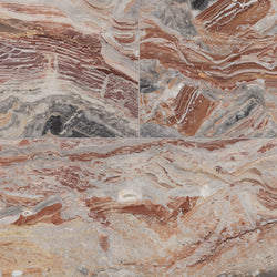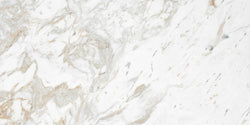
Bianco dolomiti standard dolomite tile
12" X 24" X 3/8"
Bianco Dolomiti Standard
Honed
$42.00 per S/F
Tile that goes with Agreeable Gray brings out the timeless appeal of Sherwin Williams’ most popular warm gray. From marble slabs with soft veining to neutral stone and backsplash tile, this collection highlights products that balance gray undertones with warmth. Explore flooring, countertops, and wall tiles that complement Agreeable Gray in kitchens, bathrooms, and living spaces.
If you’re looking for the best tile that goes with Agreeable Gray, you’re in the right place. Sherwin Williams Agreeable Gray (SW 7029) has become one of the most popular paint colors for homeowners and designers. It’s a warm gray, also known as greige, that balances beige undertones with subtle gray depth. The flexibility of this wall color means you can pair it with a wide range of tiles for kitchens, bathrooms, and flooring. The key is understanding how undertones, natural light, and surrounding cabinetry or trim work affect the final design.
Agreeable Gray is often called a “classic” greige because it blends the warmth of beige with the coolness of gray paint colors. In some rooms it looks soft and warm, while in others it leans toward a bit darker taupe, depending on natural light and exposure. This quality makes it a neutral that works in almost any room, from open living spaces to cozy bathrooms.
You can also compare Agreeable Gray to similar paint colors like Accessible Beige, Anew Gray, or Revere Pewter. Each has unique undertones, but Agreeable Gray remains one of the most timeless choices for homeowners who want balance.
Every paint color carries undertones that influence how it interacts with tile. With Agreeable Gray, the undertones are warm beige with a hint of gray. In strong sunlight, the paint can feel brighter and lean warmer. In low-light spaces, the gray tones come forward.
That means tile pairings should account for these shifts:
Designers often use Agreeable Gray alongside complimentary paint colors such as Pure White, SW Alabaster, or trim in crisp whites. Cabinets in white or darker wood tones create strong contrast, while warm beige cabinetry feels more subtle. These coordinating colors influence the tile you select.
For example:
Tile is a great option when designing with Agreeable Gray because it can either fade into the background or act as a statement piece. Here are some directions you can take.
White paint colors already pair seamlessly with Agreeable Gray, so bright white tile is a natural fit. White marble slabs or porcelain tiles can immediately brighten up a kitchen or bathroom painted in Agreeable Gray. This look works best when you prefer the clean look of a classic palette.
If your room has cabinetry in beige or cream tones, tile in those shades creates a cohesive, timeless effect. Travertine, limestone, or cream-toned mosaics are all beautiful choices that can grow with the space over time without feeling dated.
Since Agreeable Gray belongs to the family of gray paint colors, pairing it with marble that has gray veining creates movement and depth. Carrara, Arabescato, or Statuario are excellent examples. This approach is all about the symmetry and movement of natural stone, inspiring you to think beyond plain tile.
To emphasize the greige character of SW Agreeable Gray, taupe or greige flooring tiles are the perfect spot to use. These tiles can balance the impactful design of darker cabinets while tying in with the undertones of the wall color.
Some homeowners notice pink undertones in Agreeable Gray when paired with certain trims or doors. You can counteract this warmth by introducing tile with subtle gold veining or warm metallic accents. This creates an unexpected focal point, especially in backsplashes.
Kitchens are often the most common place homeowners ask about tile that goes with Agreeable Gray. Here are a few key points to think about:
Bathrooms benefit from Agreeable Gray because the neutral wall color allows you to get creative with tile.
Flooring choices can make or break a space painted in Agreeable Gray. Neutral stone floors with natural variations provide timeless charm. Patterned floors, such as mosaics or geometric designs, can also give your room a lively pop.
Trim work should balance the wall color and tile. Crisp white trim is often the most popular choice, though warm beige or gray trim can also work depending on the cabinetry and flooring.
Lighting plays a huge role in how Agreeable Gray interacts with tile. In bright rooms, white and gray tiles look best because they keep the space from feeling too warm. In low-light rooms, warmer beige or taupe tiles balance the cooler undertones.
Keep in mind that light exposure changes throughout the day. It’s always smart to test tile samples in different lighting conditions before committing.
Countertops are another area where tile pairings matter. If you want countertops that stand out against Agreeable Gray, go with bold marble slabs featuring strong gray veining. If you’d love a subtler approach, cream or beige stone provides a softer look.
When comparing Agreeable Gray to other Sherwin Williams shades like Anew Gray, Revere Pewter, or Accessible Beige, the same logic applies. Agreeable Gray is often the most versatile, but the tile that works for one of these colors often works for the others too, with small adjustments for undertones.
Homeowners often wonder: Should tile be lighter or darker than Agreeable Gray? The truth is that both work. Lighter tile keeps the design airy, while darker tile creates contrast and depth. The choice of material doesn’t have to feel overwhelming; it should feel like it tells the story of your home.
It’s easy to understand why Agreeable Gray is one of Sherwin Williams’ most requested wall colors. It pairs with bright whites, warm beiges, gray-veined marbles, and taupe flooring. You can also use it with cabinetry in white, dark wood, or greige tones.
If you want to create a timeless design, white or marble tile is a safe choice. If you want to go bold, patterned or veined slabs will give you a chance to make a statement. Tile that goes with Agreeable Gray doesn’t have to be complicated — it just has to complement the undertones, natural light, and design vision you already have.
Read Less12" X 24" X 3/8"
Bianco Dolomiti Standard
Honed
$42.00 per S/F
12" X 24" X 3/8"
Bianco Dolomiti Standard
Polished
$41.00 per S/F
12" X 24" X 3/8"
Bianco Dolomiti Extra
Polished
$56.00 per S/F
12" X 24" X 3/8"
Bianco Dolomiti Select
Honed
$50.00 per S/F
24" X 24" X 3/8"
Bianco Dolomiti Select
Honed
$89.00 per S/F
4" X 12" X 3/8"
Bianco Dolomiti A1 Select
Honed
$36.00 per S/F
4" X 4" X 3/8"
Bianco Dolomiti
Honed
$48.00 per S/F
12" X 24" X 3/8"
Bianco Dolomiti Select
Polished
$50.00 per S/F
18" X 36" X 3/8"
Bianco Dolomiti Select
Polished
$91.00 per S/F
4" X 12" X 3/8"
Bianco Dolomiti A1 Select
Polished
$36.00 per S/F
12" X 24" X 3/8"
Calacatta Gold
Honed
$71.00 per S/F
18" X 18" X 3/8"
Calacatta Gold
Honed
$83.00 per S/F
24" X 24" X 3/8"
Calacatta Gold
Honed
$120.00 per S/F
6" X 12" X 3/8"
Calacatta Gold
Honed
$54.00 per S/F
12" X 24" X 3/8"
Calacatta Gold
Polished
$71.00 per S/F
18" X 18" X 3/8"
Calacatta Gold
Polished
$83.00 per S/F
24" X 24" X 3/8"
Calacatta Gold
Polished
$120.00 per S/F
6" X 12" X 3/8"
Calacatta Gold
Polished
$50.00 per S/F
24" X 48" X 11/32"
Cream
Semi-Polished
$19.00 per S/F
24" X 48" X 11/32"
Sand
Semi-Polished
$19.00 per S/F
High Honed 16" x 24" x 3/8" Stone Aris Edge
$49.00 per S/F
1-1/4"
Arabescato Vagli
Polished
$240.00 per S/F
3/4"
Arabescato Vagli
Polished
$175.00 per S/F
3/4"
Arabescato Vagli
Honed
$175.00 per S/F
3/4"
Arabescato Corchia A1 Select
Polished
$185.00 per S/F
3/4"
Arabescato Corchia
Moonface
$120.00 per S/F
3/4"
Arabescato Corchia
Graffiti
$120.00 per S/F
3/4"
Arabescato Corchia
Honed
$185.00 per S/F
Honed 12" x 24" x 3/8" Stone Aris Edge
$32.00 per S/F


